
Is Economic Growth Speeding Up or Slowing Down?
Despite a rough year on the markets and increasing concern about the effects of an ongoing trade war, 2018 was yet another good year for the US economy, with GDP up an estimated 3.1% for the year. But can the good times keep up or is this just a positive blip in an era of otherwise slow and stagnant growth? That, of course, is the $64 trillion question, and one economists are increasingly concerned over. For despite a pretty good couple of years, economic growth in the US and across the developed world has been pretty weak in this last decade since the financial crisis, and there’s a growing recognition that something fundamental has changed. In 2011, the popular economist Tyler Cowen published The Great Stagnation, claiming that the US was in the midst of a prolonged productivity slowdown that would last into the indefinite future. In 2013 former World Bank chief economist Larry Summers proposed the idea of a “Secular Stagnation” to the IMF, which Nobel laureate and New York Times columnist Paul Krugman quickly picked up on and started signal-boosting. Then in 2016 Robert Gordon published The Rise and Fall of American Growth to widespread acclaim from economists all over, despite a thesis that is exactly as pessimistic as it sounds. Economics, long known as the dismal science, is starting to sound downright depressing these days.
And yet, on the other hand, most people in the real world have an intuitive sense that technological progress just keeps moving faster and faster, and one of the major economic concerns we keep hearing about, including from economists, is whether or not robots are going to take all our jobs, a topic I wrote about recently. It should seem obvious that a world of economic stagnation and a world of rapid technological progress causing widespread unemployment are two opposite dystopias, and they can’t both be true, so which is it? Are things speeding up or slowing down?
This, it turns out, is not nearly as straightforward a question to answer as it might sound. It will require us to take a much more expansive view of the data across time and space than I’ve seen most observers take. But before I inundate you with graphs, let’s consider the arguments first. Why might we think, a priori, that economic growth might be slowing down, or speeding up for that matter?
Towards a Theory of Half-Full vs. Half-Empty
Among the pessimists, the arguments basically fall into one of two camps: demand side and supply side. Economists who emphasize the demand side, such as Larry Summers and Paul Krugman, say that macroeconomic policies and financial market conditions have resulted in a world where real interest rates are at or near zero, and this has discouraged investment and real economic activity as a result. This is basically just a present-day restatement of the liquidity trap, an idea made famous by John Maynard Keynes back during the Great Depression. This is an important argument, and one I might take up in another post, but I’m going to basically ignore it for the time being, because I consider it the less interesting of the two stagnation arguments. A “secular stagnation” of this sort might last a couple decades, but probably not forever, and it can at least in principle be solved by better macroeconomic policy, as some economists would argue it already has, at least in the US, where real interest rates have recovered from zero and are now not too far below their long-term averages.
The supply-side argument for economic stagnation is chronic and much more serious. It can be summarized as “diminishing marginal returns,” or, as Tyler Cowen more poetically put it, “America ate all the low-hanging fruit of modern history.” Basically, so the argument goes, there’s only so many scientific discoveries out there to be made, so many technological innovations to be had, and so on. We tend to discover the easy ones first; that’s why they’re easy. What’s left are the hard problems, which we have to throw ever more resources at in order to get the same degree of progress we got from the earlier stuff. Thus, the steam engine was invented by tinkerers with primitive tools and little understanding of the underlying physics, the nuclear fission reactor required a revolutionary new understanding of the laws of nature under relativity and quantum mechanics, led by a team of the world’s preeminent scientists working on one of the most ambitious projects in history, and the nuclear fusion reactor has been “five or ten years away” for well over fifty years now.
In this view, the incredible progress made over the last few decades in computer technology isn’t actually all that incredible after all, at least in comparison to the innovations the previous century from 1870 to 1970 brought: electricity, indoor plumbing, airplanes, automobiles, penicillin, anesthetic, radio and television. As Peter Thiel famously quipped, “We wanted flying cars, instead we got 140 characters,” Or, to bring the comparison closer to home (literally), consider the kitchen of today vs. the kitchen of 50 years ago. Today’s kitchens might be a bit more spacious and have a bit less tacky wallpaper (I say this as somebody whose kitchen was last renovated in the ’70s), but the only major difference is that contemporary kitchens have a microwave oven. Now compare the kitchen of 50 years ago with the kitchen of 100 years ago. The latter has no refrigerator, no dishwasher, no toaster, maybe not even a sink with running water, and the stove is probably powered by wood. Most people alive today wouldn’t even know what to do inside one.
According to the supply-side stagnation argument, the industrial revolution was essentially a one-time windfall event in history; economic progress was close to zero before it, and now that we’ve mostly squeezed out all of its juice, it will probably be close to zero in the future as well, so get used to it.
That’s what the pessimists say; what about the optimists? Last year the Nobel Prize in economics went to Paul Romer for his work on Endogenous Growth Theory, which predicts that because ideas, including scientific knowledge, are “non-rival” – that is, anybody can freely use them without depriving others of it – they result in increasing returns to scale of labor and capital and sustained economic growth. As Romer said after winning the prize, “The question that I first asked was, why was progress . . . speeding up over time? It arises because of this special characteristic of an idea, which is if [a million people try] to discover something, if any one person finds it, everybody can use the idea.” Romer then suggested that as we get more people working on creating ideas, whether through population growth or global integration, we should get not just sustained exponential growth but accelerating exponential growth.
The problem with this idea is that it assumes that as we add more researchers, their productivity remains the same, which doesn’t seem to be the case, mostly for the low-hanging fruit reasons we just saw. In a recent interview with Tyler “Great Stagnation” Cowen, Romer even admitted he was too optimistic, pointing to the findings in a highly influential new paper, Are Ideas Getting Harder to Find? which shows how across a wide variety of disciplines and industries, exponential progress is only being sustained by throwing an even-faster-exponentially-growing amount of resources and person-hours at the problem. From the abstract:
We present a wide range of evidence from various industries, products, and firms showing that research effort is rising substantially while research productivity is declining sharply. A good example is Moore’s Law. The number of researchers required today to achieve the famous doubling every two years of the density of computer chips is more than 18 times larger than the number required in the early 1970s.
We thus have two factors that influence economic growth moving in opposite directions and partially or fully offsetting one another: research productivity and number of researchers. From the authors, like so:

If economic growth is slowing down, it’s because the former is dominating, if it’s speeding up, the latter is. Which one it is is an empirical question, so enough theorizing for now, let’s get to the data!
Graphs!
GDP as a concept was invented in the 1940s, and that’s how far back the official statistics go in the US. But several academic efforts have worked to backfill them to much earlier dates. Here’s US GDP per Capita for every year going back to 1800, according to the Maddison Project.
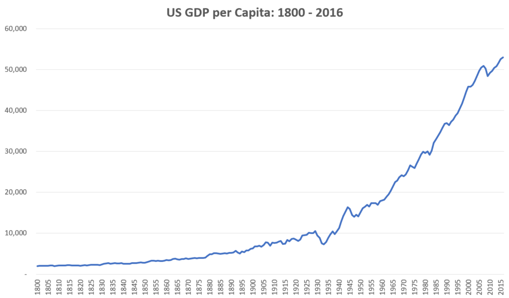
The quintessential example of long-run exponential growth. Here’s the same data on a logarithmic chart, along with the best-fit exponential trend line (the dotted line).

US growth has followed its long-term trend remarkably well over the last two centuries, with barely a hiccup surrounding the Great Depression. It would seem that the growth rate since the start of the industrial revolution has been very nearly constant at about 1.5% per year, with the opposing forces of declining research productivity and increasing research person-hours perfectly offsetting each other.
But if we plot the average growth rate itself over time we start to see some more subtleties. Below I plot the annualized per-capita GDP growth over the previous ten year period, as well as its trendline.
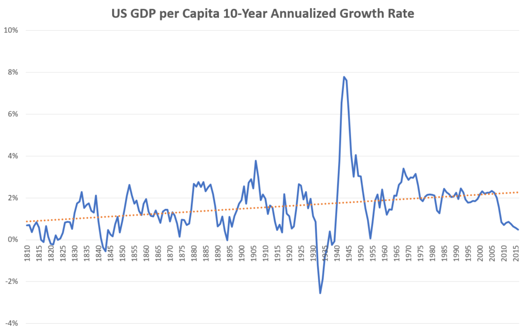
A couple things immediately jump out from this graph: 1) average growth rates have been slowly but steadily trending up over time (consistent with the “speeding up” hypothesis); and 2) over the last decade or so growth has been well below trend (consistent with the “slowing down” hypothesis). On the first point, the slope of the trendline is 0.00007, meaning that every year, the trend rate of economic growth has been increasing by 7 thousandths of a percent. This might sound trivially small, but with 217 years of data it’s highly statistically significant (at the 99.99% confidence threshold), and has added up to the average growth rate roughly doubling over the sample period. To give a sense of the economic significance of this, in the early days of the 19th century, living standards were doubling at a rate of roughly every 70 years. At the more recent levels of trend growth, living standards are doubling more like every 30 years. Accelerating growth is a big deal.
But that’s if things keep up the way they have been. More recently growth has been lackluster, about what it was in the early days of the industrial revolution, and things are even slower in Europe and Japan. The growth pessimists would say this is exactly what we should expect; sure, growth was accelerating for a while as knowledge was disseminated through the information technologies of print, telephones, radios, and finally the internet, but ultimately the story of economic growth is not an exponential line shooting up towards infinity, but an S-curve, accelerating upwards at first and then decelerating back towards a plateau.
If we look at the difference in average growth rates between the 1950-1999 period and the 2000-2016 period, the latter is lower by an amount just on the edge of statistical significance (equal to the 98% confidence threshold). So pessimists can take this as confirmation of their theory, and optimists can counter that the long-term trend is more robust and the recent period is probably just a fluke.
This is about where the conversation usually ends as far as the data are concerned. Everybody acknowledges that growth in rich, developed countries has been slow in recent years, the open question is how meaningful this is and what, if anything, is to be done about it. Everybody also acknowledges that this observation mostly doesn’t apply to emerging countries, which in aggregate have actually been growing at a fairly nice clip. For some reason, almost nobody seems to raise the question of how the two might be related.
In my post on globalization, I pointed out that actually a very straightforward prediction of development economic theory is that as many of the “third-world countries” began to adopt liberal, democratic, capitalist institutions and integrate themselves into the global economy, global economic growth would “run-off” from the rich countries to the poor ones. This is exactly what’s happened. Over the last 30 years, while many have pointed out that within the US (and most other rich countries) the richest people have experienced the fastest income growth, when we look across the world the situation is exactly reversed: the richest countries have experienced the slowest economic growth and the poorest countries the fastest.
Could this recent global development explain what’s going on with the supposed growth slowdown? Maybe the trends we’ve recently seen speak less to the fundamental nature of economic growth and more to a bias in our sample. If we want to look at economic growth in the long run, we shouldn’t limit ourselves to just the United States or even “the developed world.” We should take as broad a view as possible, looking ideally at the entire world in aggregate.
This is more difficult than it sounds. We don’t have very good data on the entire world going back very far. Lots of countries never really bothered to keep track of GDP or other economic data before 1990 or so, and those that did had already reached a point of development where they could. So we have a sample bias; when looking at historical GDP data, we’re only looking for the most part at the places that were already growing and not at those that weren’t, which is going to bias our results if we’re trying to analyze long-run world growth. For this reason not a lot of sources provide detailed GWP (Gross World Product) data back any significant amount of time.
One way to address this concern is to use overlapping time series of partial samples. We only have complete data for pretty much the whole world since 1990, and we only have data going back to 1800 for a small handful of countries, with varying degrees of coverage for all the years in between. So one thing we can do is look at samples of countries based on their common coverage periods and see if there’s anything interesting we can glean by their dynamics over time as new samples are introduced.
Below I plot the aggregate long-run GDP of different samples of countries from five starting points: 1820, 1900, 1950, 1970, and 1990, again using the Maddison Project data. Each series contains all the countries from the previous series, plus whichever ones with data available as of that date.
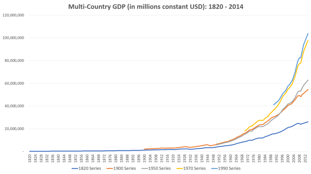
The 1820 series contains only a small number of Western countries that were among the early adopters of industrialization: France, Denmark, Italy, the Netherlands, the UK, and the US, most notably. By 1900 we have most of Western Europe, the Anglosphere, Japan, and much of Latin America. By 1950 we have an increasing number of non-developed nations in Africa and Asia, and in 1970 we have several more, including most notably China. By 1990 we have virtually universal coverage, and the line approximately represents Gross World Product. (Note, the time series for 1950 and later uses slightly different sources than the earlier ones, hence why the 1950 series is sometimes lower than the 1900 series, despite the former having all the same countries as the latter plus more.)
The world economy today is worth more than $100 trillion, about 5 times that of the combined total of the Western Power economies represented in the original sample. It’s also clear just from eyeballing the graph that the more inclusive the sample is, and thus the more later-developing nations it has, the faster it’s been growing in recent years.
I now convert the series to GDP per Capita, the usual measure of living standards.
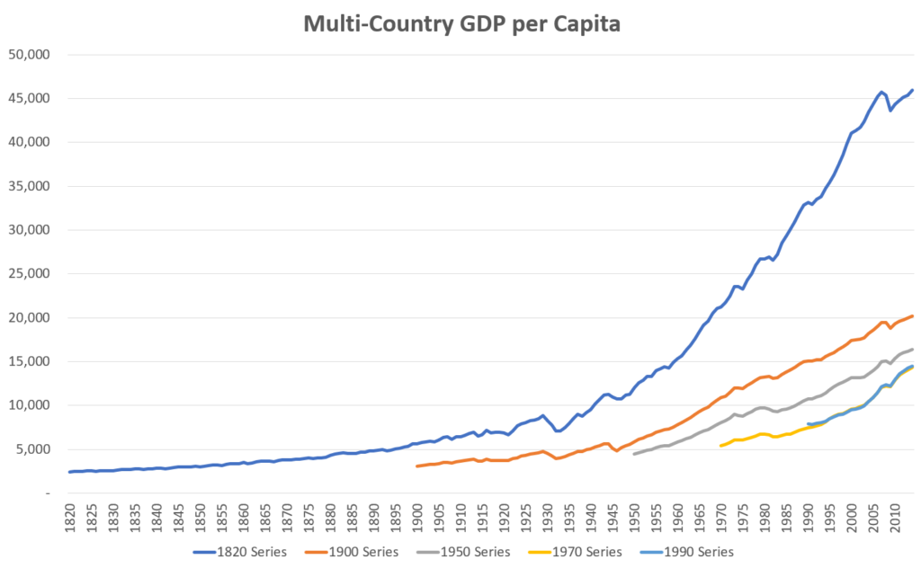
Here we see a somewhat opposite pattern as before: the earlier series samples end up at higher numbers than the later ones. This is the effect of what I pointed out above: countries only start having reliable data once they reach a certain point of development. When countries first enter a sample, they are typically very poor, roughly on the order of what the average American was like two hundred years ago. Their numbers drag down the average. So the citizens of the exclusive 1820 sample in Western Europe and America have average incomes over $45k today, looking at the most inclusive sample of the entire world, it’s less than a third of that.
Now let’s do what we did for US per capita GDP growth and convert these into plots of 10 year average annualized growth rates for each series.
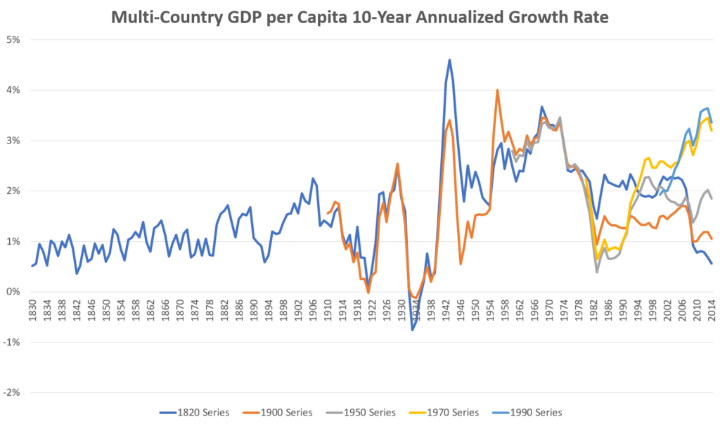
This chart is kind of a mess, especially in the later years, but we can spot a few key patterns. The dark blue series representing the most advanced industrialized countries follows the same basic trajectory as it did for the US on its own: slow growth in the start, gradually picking up throughout the 20th century, then dropping off pretty dramatically in the new millennium. But while we see here that the recent economic stagnation is a problem across the entire developed world, looking at the other samples that include less developed countries, there’s no signs of any stagnation at all. In fact, looking at where the time series end when they cross the “finish line” in 2014, we see that there’s a monotonic relationship where the more inclusive a sample is of poorer, developing nations, the higher its rate of economic growth was over the preceding decade. The light blue 1990 series encompassing the entire world shows growth rates in recent years that rival those of the developed world’s nostalgic post-WWII boom era.
What’s more, the drop-off in developed-world growth rates coincides with the acceleration of entire-world growth rates, perfectly consistent with my “run-off” story in which capital flowing out of developed markets into emerging markets in search of higher returns causes slower growth in the former and faster growth in the latter, with the net effect being to boost economic growth for the entire world.
So now let’s look at the entire world in the long run. To do this, I splice together all the series in the above chart into one time series. I start with the 1820 series, then every time a newer, more inclusive sample becomes available, I switch to that and plot it going forward. Thus we approximate per capita Gross World Product growth by looking at broader and broader samples over time. I again include the trendline as well.
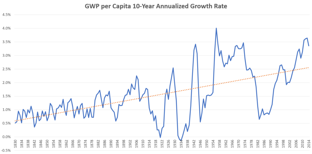
I gotta say, when I first plotted these data, I was blown away. I checked the data several times to make sure I didn’t make any errors, but I couldn’t escape this conclusion: for the last two centuries, around the entire world, living standards are not just growing at an exponential rate, but the growth rate itself is rapidly accelerating. And far from there being a recent stagnation, growth in recent years has actually been well above its long-run trend (although within the normal range of fluctuation). The slope of the trendline is 0.011% per year, nearly double that of the US time-series, and is statistically significant at the 99.999999999999999999% confidence threshold, the sort of results you normally see in particle physics, not macroeconomics. This has resulted in the trend growth rate roughly quintupling over the sample period from about 0.5%/year (a doubling time of roughly 138 years) up to just over 2.5% today (a doubling time of ~27 years).
In fact, these data almost certainly understate the true degree of acceleration. Again, at any given time we’re only looking at those parts of the world that were developed enough to have data, which means we’re generally not looking at those places that haven’t started growing yet. The ~0.5% rates we see in the early 19th century were only enjoyed by a small number of major Western powers. Most the rest of the world was still stuck in a no-growth state, which means the true rate of global growth was probably only just barely above zero. In the post-WWII boom when growth peaks at 4% we’re still only looking at about half of the world; much of the other half was still literally starving under oppressive regimes that retarded economic growth. The true global rate was perhaps only 3% or less.
When we zoom out from the day-to-day headlines and our own little corner of the world, the takeaway is clear. The economy these days is growing faster than it ever has before, and – averaged over the ups and downs of the business cycle – is continuously speeding up.
Haters Will Say It’s Fake
“Okay, sure. Maybe economic growth across the whole world is technically speeding up,” I can already hear the pessimists say, “but that’s just coming from catch-up growth, not from real technological innovation, the only way to permanently boost living standards in the long run and push out the frontier of economic development. The fact remains that we simply aren’t innovating at the same rate we did 100 years ago, due to the unassailable forces of diminishing returns. Poorer countries can still enjoy rapid economic growth by simply copying the institutions and technologies of first-world countries, and that’s all well and good, but eventually they will fully catch up and run into the same wall that the developed world is already up against, and then we will really be in the age of stagnation, the whole world over.”
I have a couple responses to this. The first is that, while economists often make this distinction between catch-up growth vs. growth at the “technological frontier,” in practice the line between the two is blurry. With a per-capita GDP of about $20,000, China is still pretty poor by US standards, and still has a lot of catching up to do. But that hasn’t stopped China from already emerging as a global leader in such high-tech fields as solar energy, artificial intelligence, and genetic therapies, not to mention its prominence in telecommunications and software industries. India, similarly, has multiple leading firms in the software and pharmaceutical industries. When we look at the breakdown of emerging market stocks in aggregate, we see that roughly 20% of their companies by market cap are in the technology sector, about what it is in the United States. People in developing countries can actually start contributing to science and technology pretty quick, which gives us more resources that can be thrown into research and development, which will allow us to offset the effects of gradually declining research productivity for generations to come.
The second response is that the recent decline in innovation on the frontier is a perfectly rational response to market incentives, and something that may very well change when the incentives change. If capitalists can get higher returns by bringing 19th and 20th century technologies to undeveloped parts of the world than they can by inventing the next technological breakthrough, then what you’re going to see is a society that prioritizes lifting the floor on the world’s poor over raising the ceiling on our technological prowess, and that’s exactly what we’ve got. This may help explain the source of the common lament that too many of our brightest young minds in America are going into finance these days, instead of say, science or engineering (according to Harvard 18% of their graduates go into finance, tied for first with “consulting”, which is usually related to finance). If the primary role of rich markets these days is to bankroll the development of poorer countries, it makes sense that finance would play an increasingly important role in those parts of the world with the highest concentrations of capital.
While this has been a great humanitarian achievement, techno-enthusiasts may feel wistful that our economic system isn’t allocating more resources to basic research and development (“We wanted flying cars, instead we got railroads in Africa!”), but the silver lining is that as globalization evens things out more and brings more nations closer to the frontier of development, then the incentives will shift back to prioritizing the cutting edge of technology, only the global nature of the economy will mean there is both vastly more talent to draw upon for research and development, and there is a vastly larger market to sell to than could have ever been the case back when technological progress came from just a small handful of Western European and Anglophone countries. In this light, the era of globalization beginning in the ’80s did not coincide with the end of technological progress, but was a long-term investment in even-greater technological progress in the future.
There’s another, more technical objection to this narrative that I want to address. Skeptical readers may have been surprised by my earlier claim that it’s hard to find much long term data on global per-capita GDP growth. A quick Google search reveals that the World Bank has been tracking this going back to 1960. Here’s what their data look like:
These are somewhat different figures than I’ve shown above, and most significantly it looks like the trend, if anything, is downward. It turns out these discrepancies are mostly due to the different ways to adjust for currency effects. Whenever you’re comparing the economies of two different countries, you have to account for the fact that they’re each using different yardsticks to measure their GDP, say US dollars in America, and renminbi in China. The easier, usually more official way of doing this is to use market exchange rates. China’s GDP is ¥95 trillion, and the exchange rate between dollars and renminbi right now is 0.15, so their economy is $14.2 trillion, or about $10,000 per capita (notice that’s half the figure I cited above). But outside of international trade and global financial flows, exchange rates are not particularly relevant to the economic activity of most people around the world. In fact, most Chinese goods bought by Chinese people are cheaper than their counterparts in the US, so their $10,000 per head goes a lot farther there than it would in the US. To compensate for these effects, economists make Purchasing Power Parity (PPP) adjustments. So while exchange-rate based figures are easier to calculate and are more commonly cited in the financial press, it’s generally recognized that PPP-adjusted figures are more relevant for comparing living standards around the world and across time. And these adjustments can be very significant. Adjusting China’s economy for PPP roughly doubles the measured size of their economy. Similar effects around the developing world mean that measuring growth by exchange rates, as in the World Bank graph above, substantially understates the “real” extent of the growth more accurately captured by PPP-adjusted data, which is what I’ve been using in all my preceding analysis.
The World Bank does also include PPP-adjusted global per-capita GDP figures, but again, they only go back to 1990. But substituting these figures in place of my 1990 series above makes my case for accelerating growth even stronger, as the World Bank data shows significantly higher growth in recent years than the Maddison Project data does, as high as 4.9% over the last decade.
So here’s the most important story in the world over the last half-century or so: starting in the early 1980s the world started seeing waves of liberalizations and other reforms in under-developed countries to open themselves up to global markets, lifting themselves out of poverty and onto a path of rapid economic growth that continues to this day. An integral part of this process was the reallocation of capital held mostly by rich, Western nations away from domestic investment on the technological frontier and towards basic economic development in foreign, emerging markets. A consequence of this has been a slowdown of economic growth among rich, developed nations and arguably in cutting-edge technological innovation more generally. The working classes of the developed nations have been the major losers in this process, and have seen little to no real wage increases for decades, as they face an ever-larger pool of competition around the world. This has led many observers, mostly only focusing on the US or the developed world, to speculate that we’ve entered an age of economic stagnation, and to paint all sorts of socioeconomic dystopias in which the rich grab ever-larger slices of a shrinking pie. In fact, if we look at the world as a whole, we see that extreme poverty is rapidly falling towards zero, economic inequality is declining, and economic growth is accelerating, with peoples’ living standards are improving now faster they have ever been. As more countries catch up and approach the technological frontier, innovation will become more globally distributed than it was in the early days of the industrial revolution, and perhaps we will see a new technological renaissance, one which will once again lead to rising fortunes in the developed world as well.
DISCLOSURES
RHS Financial, LLC is a Registered Investment Adviser. Advisory services are only offered to clients or prospective clients where RHS Financial, LLC and its representatives are properly licensed or exempt from licensure. This website is solely for informational purposes. Past performance is no guarantee of future returns. Investing involves risk and possible loss of principal capital. No advice may be rendered by RHS Financial, LLC unless a client service agreement is in place.
RHS Financial, LLC provides links for your convenience to websites produced by other providers or industry related material. Accessing websites through links directs you away from our website. RHS Financial, LLC is not responsible for errors or omissions in the material on third party websites, and does not necessarily approve of or endorse the information provided. Users who gain access to third party websites may be subject to the copyright and other restrictions on use imposed by those providers and assume responsibility and risk from use of those websites.
General Notice to Users: While we appreciate your comments and feedback, please be aware that any form of testimony from current or past clients about their experience with our firm on our website or social media platforms is strictly forbidden under current securities laws.
Other Important Disclosures pertaining to RHS Financial and its services:
Investment products: Are not Bank Guaranteed – Are Not FDIC Insured – May Lose Value
Assets are held at Charles Schwab (and/or) Interactive Brokers, Member(s) FDIC, SIPC
This cannot be construed as a solicitation or recommendation to purchase a security(ies) as RHS Financial and its opinions are subject to change given varying market conditions and the relative time horizons and risk parameters of its clients. The strategies and performance is based upon what we believe to be reliable and correct sources but cannot be guaranteed.
The S&P 500® index and the ACWI are indexes of widely traded stocks. As is the Barclays Aggregate and the Barclays Global Aggregate Bond Indexes. Indexes are unmanaged, do not incur fees or expenses and cannot be invested in directly.
Past performance is no guarantee of future results.
Investing in sectors may involve a greater degree of risk than investments with broader diversification.
International investments are subject to additional risks such as currency fluctuations, political instability and the potential for illiquid markets. Investing in emerging markets can accentuate these risks.
The information contained herein is obtained from sources believed to be reliable, but its accuracy or completeness is not guaranteed. This report is for informational purposes only and is not a solicitation or a recommendation that any particular investor should purchase or sell any particular security. RHS Financial does not assess the suitability or the potential value of any particular investment. All expressions of opinions are subject to change without notice.
2024 Disclosures
RHS Financial is an SEC registered Investment Advisory Firm and distributes this presentation for informational purposes only. This presentation ( hitherto referred to as the presentation throughout this disclosure), blog post, infographic, slide deck or whatever form of informational modality the reader wishes to describe this as is provided for informational purposes only and should not be construed as investment advice in any way.
We believe the information, including that obtained from outside sources, to be correct, but we cannot and do not guarantee its accuracy in any way. RHS Financial uses information from outside sources to develop graphs, charts, infographics, etc. to enhance this presentation and while we believe the information from these outside sources, to be correct, we cannot and do not guarantee its accuracy in any way,
Any opinions or forecasts contained herein reflect the subjective judgments and assumptions of the authors who may be employees of but do not necessarily reflect the views of RHS Financial as a company. There can be no guarantee that developments will play out as forecasted. The information in this presentation is subject to change at any time without notice. This presentation contains “forward-looking statements" concerning activities, events or developments that RHS Financial expects or believes may occur in the future. These statements reflect assumptions and analyses made by RHS’s analysts and advisors based on their experience and perception of historical trends, current conditions, expected future developments, and other factors they believe are relevant. Because these forward-looking statements may be subject to risks and uncertainties beyond RHS Financials’ control, they are no guarantees of any future performance. Actual results or developments may differ materially, and readers are cautioned not to place undue reliance on the forward-looking statements. In a nutshell; these are our best guesses and please don’t assume they are fact.
Mentions of specific securities, investment products, investment indices, companies or industries should not be considered a recommendation or solicitation. Data and analysis does not represent the actual or expected future performance of any investment or investment product Index information is used to illustrate general asset class exposure, and not intended to represent performance of any investment product or strategy.
This post may contain references to third party copyrights, indexes, and trademarks, each of which is the property of its respective owner. Such owner is not affiliated with RHS Financial and does not sponsor, endorse or participate in the provision of any RHS’ services, or other financial products. Index information contained herein is derived from third parties and is proffered to you unaltered as we derived it from the third party.
RHS Financial, LLC is a Registered Investment Adviser. Advisory services are only offered to clients or prospective clients where RHS Financial, LLC and its representatives are properly licensed or exempt from licensure. This presentation is solely for informational purposes. Past performance is no guarantee of future returns. Investing involves risk and possible loss of principal capital. No advice may be rendered by RHS Financial, LLC unless a client service agreement is in place.
If the client is deemed suitable and agrees, RHS may employ leveraged strategies for these clients. Leverage attained through margin on a client’s account can add additional risk. While RHS tends to seek to improve return with theses strategies by applying leverage to less risky indexes, there is no guarantee that that RHS will lower risk or improve returns.
RHS Financial. 4171 24th St. Suite 101 San Francisco, CA 94114


