As you no doubt have heard, the US and world economy is in a tough place right now. Unprecedented government stimulus from the COVID crisis, lingering supply chain disruptions, and the war in Ukraine have all contributed to an inflation rate rising to the highest levels we’ve seen in decades. And with the Fed and other central banks now raising borrowing costs at rapid rates amidst continued supply shocks there is growing pessimism that we are teetering on the brink of recession.
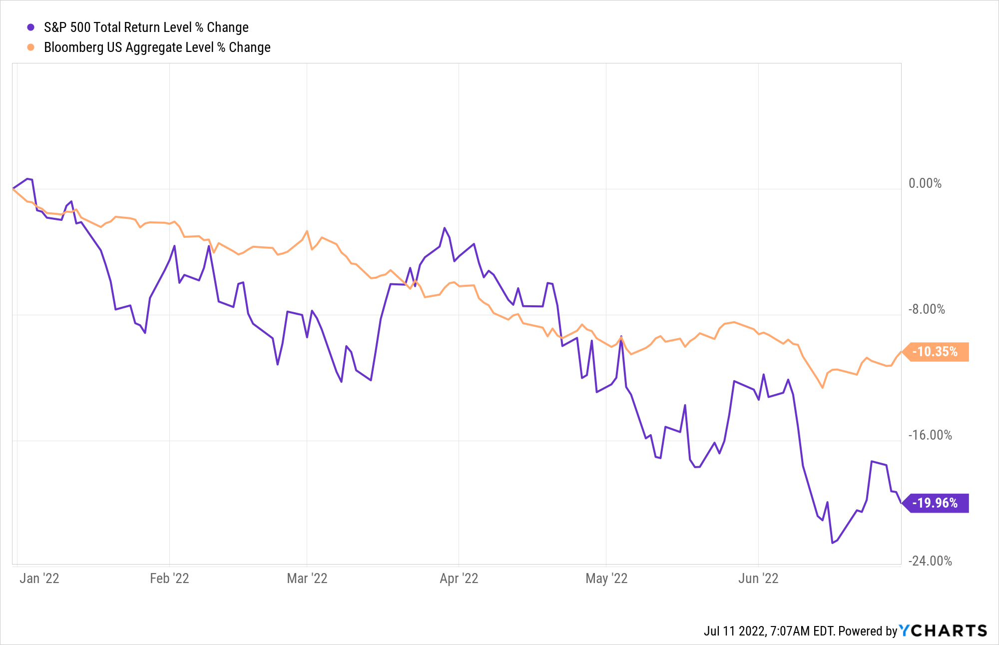
Against this backdrop, the first half of 2022 turned out to be a pretty rough one for financial markets. Rising inflation and falling economic growth is the worst of both worlds for investors, typically hurting both stocks and bonds. Indeed, the first six months of 2022 turned out to be the worst first half since 1970 not just for the S&P 500, but for the classic “60/40” asset allocation as well. US stocks were down 20% as measured by the S&P 500, while US bonds – which are generally much less volatile than stocks – were down over 10% as measured by the Bloomberg US Aggregate Bond index.
Of course, January to June are arbitrary starting and stopping points. How does this six-month period compare to others on record? To answer this I looked at data on US stock and bond markets from Morningstar/Ibbotson Associates back to 1926 to see where this recent six-month period falls in the distribution of all six-month periods since then.
If we plot the returns for every six-month window on the US stock market and find where this most recent period lands it looks like this:

The worst six-month window ever experienced by US stocks was the period ending May 1932 with stocks losing slightly over half their value. The best six-month window was barely over a year later at the end of August 1933 with stocks roughly doubling. But on average stocks have earned a much more prosaic 5.98% every six months. (Note: these distributions include overlapping observations, i.e. the window ending in June will have five months in common with the window ending the previous month in May, so the most extreme observations will tend to have clusters around the same time. The second-worst-ever window for stocks after May ’32 is June ’32!) I have highlighted in red the first half of this year. We can see that it’s near the far end of the bad side of the distribution, at the 3.4th percentile to be precise. Mostly only a handful of crisis periods around the Great Depression and ’08 Financial Crisis suffered worse half-year drawdowns.
What about bonds? While bonds are commonly benchmarked against the Bloomberg Aggregate Bond index, due to greater data availability I look at the returns on Ibbotson’s long-term government bond index. Long-term bonds tend to be more volatile than aggregate bond markets so these results will be more extreme than those found in common bond portfolios.
Long-term government bonds were down 18.41% in the first half of 2022, almost as bad as stocks. How does this compare to history? The results here are even more extreme.

The period ending June ’22 was the 3rd worst six-month drawdown for bonds ever, and the 2nd worst was the previous month, May ’22! Only March 1980 was (slightly) worse at a -18.8% drawdown. And so this recent episode is basically tied for last place as the worst bond market rout of all time.
What makes this recent half-year all the more remarkable is how the bear markets in stocks and bonds have coincided. Over history, stocks and bonds in the US have basically been uncorrelated. In recent decades they’ve even tended to be negatively correlated: periods of large stock market losses have been offset by big bond gains and vice versa. We can we this by comparing the joint performance of stocks versus bonds during periods when either was in a drawdown. Below I show, in addition to the recent period, the five worst six-month windows for stocks and what bonds did during that time and then the same thing the other way around (for clarity, here I throw out overlapping observations and just use the worst window within a given cluster).

As we can see, usually when stocks have done poorly, bond returns are scattershot but generally positive and contrariwise when bonds have done poorly stock returns have also been scattershot but generally positive. This is of course the whole point of diversification: the returns of a portfolio can be smoothed out by incorporating assets with different return patterns. The first half of this year stands out then for being extremely unusual then in that both stocks and bonds had simultaneously unusually bad performance.
The result of all this has been that the first half of 2022 was one of the worst drawdowns for traditionally diversified portfolios on record. Below I repeat this exercise for the classic 60/40 portfolio (60% stock, 40% bond, using here monthly averaged returns).

The return on a 60/40 in the first half of 2022 was in the bottom 0.9th percentile of all time. Only the depths of the Great Depression, the Financial Crisis, and the stagflationary 70s saw worse episodes, and only by a little bit (and of these, only the stagflationary 70s had simultaneously bad stock/bond markets, which makes sense given the similar macroeconomic conditions to today).
Finally, for you quant geeks out there, I have written before about how aggressive investors may leverage up moderate, diversified portfolios to get similar risks as stocks with higher long-run returns. The most popular version of this strategy is Risk Parity, but I refer to them as Leveraged Asset Allocation Strategies (LAAS) more generally. Depending on your exact construction methodology, risk parity and other LAAS portfolios based just on stocks and bonds had in the first half of 2022 either their worst six-month period ever or BY FAR their worst six-month period ever. This is a little unfair though, as most such strategies incorporate at least a little exposure to real assets like commodities, which had a fantastic first half. Most risk parity funds and indexes I’m aware of had merely-slightly-worse returns than the nearly-all-time-worst returns of the 60/40 portfolio.
Where does this leave us?
We all know markets can be down for a while but in the long run they go up. If anything bear markets only create more attractive valuations and buying opportunities to get in. So such a dismal start to the year must mean markets look really attractive now, right? Well, not so fast.
For years I and other value-conscious investors have been pointing out that US stocks looked awfully expensive. In late 2020 I finally started calling them a bubble, given valuations that rivaled the peak of the dot-com bubble in 2000. Stocks continued to rally into 2021 and by the end of last year they were at – depending on which valuation metric you used – either around their all time most expensive in history or had far surpassed any previous highs. Meanwhile, bond yields in the US and other advanced countries had been skidding around zero. Given such extremes in both markets, we would have a long way to fall before being anywhere back to around normal.
Below I plot one of the most commonly used valuation indicators for the US stock market, the CAPE Ratio (Cyclically adjusted price-to-earnings) from 1900 up through June of this year.

The CAPE ratio peaked just shy of 40 at the turn of the year and is now down to about 29 as of June, a significant cheapening of the market but still well above its long-term average value of about 17.4, indicated by the dotted line. For the US market to come back down to average valuations would entail a further 40% loss from where prices are now, holding earnings constant. Now, there’s no strong theoretical or empirical reason to believe valuations will come all the way back to their long-run average, but this is just to say that even after a significant correction US equities are not cheap on a historical basis, they are actually still relatively expensive (in fact, at about the 92nd percentile in valuation since 1900 by this metric).
It’s important to note, however, that this is only true for the US market. Around the rest of the world, stocks are much more cheaply valued than they are in America. Looking at the CAPE ratio for foreign developed markets since 1979 and for emerging markets since 2001, we see that they are now currently moderately below their long-run average valuations, unlike the US still well above its average.

What about bonds? Bonds are inherently simpler assets than stocks (the cashflows on bonds are fixed, unlike stocks whose earnings grow or shrink with the economy), but it can be trickier to get a handle on their valuations over time because the attractiveness of a bond’s yield depends crucially on the inflation rate. Whereas stocks are theoretically real assets and their earnings generally increase with inflation, and so comparing a P/E ratio in a high inflation period versus a low inflation period is reasonable, for bonds a yield of 5% might seem really good or really bad depending on if inflation is 0% or 10%.
And so if we plot the yields on long-term government bonds over time we find this familiar (to those of us that look at lots of these sorts of charts) mountain shape:

Bond yields have come back up from their all-time lows of 2020, but they’re still well below their average of the last 100 years. But this is a raw (nominal) yield, and not so informative. To get a sense of relative attractiveness of yields, investors often look at spread measures such as the rate over cash yields or the rate over a recent measure of inflation. Below I plot two such spreads: the rate over T-Bills and the rate over the previous 1 year inflation rate.

Using spreads like these the effect on yields of the rise and fall of inflation in the 1960s-80s is much more muted and we can make out a more “natural” real yield in the low single-digits. But if look at how bond yields today fare compare to cash rates we find that they’re somewhat attractively high (79th percentile) whereas if we compare them to inflation over the last year they are negative and unattractively low (7th percentile), so the valuation of bonds still seems ambiguous. This is a consequence of the great inflation uncertainty of the present moment and probably both measures are overstating things in different directions. That is, basically everybody expects that over the next year or longer cash rates will rise and inflation will fall. A better measure still might be bond yields in relation to expected inflation. Since 1970 the Federal Reserve has published a Survey of Professional Forecasters, showing consensus expectations on inflation and other macroeconomic data. Looking at bond yields relative to one-year-ahead inflation expectations we see the following.

Yields in comparison to expected inflation are positive and higher compared to history than using recent inflation, but only barely so. Granted, if we looked at the spread over long-term inflation expectations (data on this only starts in 1991) it looks a good deal better, although still not great. The takeaway is that bonds in the US, like stocks, do not look especially cheap or attractive following their disappointing first half of this year.
Once again for bonds, more attractive valuations can be found looking outside the US. Emerging market bonds are currently offering yields from 7%-9%, depending on which index you’re looking at. (The same is not true for foreign developed bonds, which, unlike for stocks, are generally even less attractively valued than compared with US bonds).
While US stocks and bonds suffered in the first half of 2022 and still don’t look especially attractive, certain diversifying assets like commodities shined during the period, as did diversifying alternative strategies like trend following and value investing. American investors would do well to look outside the box (and their borders) to the things that are likely to continue to do well in the years to come.

