
Here’s a market concern we’ve been hearing from investors more and more lately:
There aren’t any good investment opportunities right now. Stocks are expensive, bonds are expensive, and cash is still paying next to nothing (and less than nothing after inflation). How is an investor supposed to make any money in an environment like this?
Since the end of the financial crisis eight years ago, being a plain-vanilla buy-and-hold investor has been a great way to make money, as US stocks have increased four-fold and bonds have benefited from falling interest rates. But with stock markets now at all-time highs, and bond yields near all-time lows, it’s unlikely that returns over the next eight years will be anywhere near as good as they have been for traditional asset classes. So can investors do anything besides accept mediocre returns? I have a few ideas.
How Bad are Things?
Before we consider what looks good in the market right now, let’s dwell on the negative for a bit. There are basically two main schools of thought on the market right now: the somewhat pessimistic view and the extremely pessimistic view. Both views start by recognizing the lofty valuations that we observe today in the stock and bond markets. They differ in where they think those valuations are heading. Let’s start with where we’re at today.
Here is a plot of the cyclically-adjusted price-to-earnings (CAPE) ratio on the S&P 500:

The CAPE ratio is probably the most commonly used metric of equity market valuation. A higher CAPE means investors are paying more for a given level of earnings. Right now the CAPE is pretty darn high, just north of 30, which, as I pointed at the beginning of the year, we’ve only seen twice before in US history: in 1929, and in the last couple years of the dot-com bubble, neither of which were very good times to start buying stocks.
Meanwhile, interest rates, as measured by the yield on 10 year treasury bonds, are the lowest they’ve been since World War II.

Source: Robert Shiller’s Online Data
Thus, the returns we can look forward to for both stocks and bonds would seem to be depressingly low right now. How low goes back to the extremely vs. somewhat pessimistic outlook. The extreme pessimists believe that we should expect mean reversion in today’s valuations. That is, the CAPE on the stock market is likely to fall back to more-or-less average historical levels, and yields will rise to more-or-less average historical rates. This, of course, is accomplished by falling prices. The mean-reversion proponents will point to charts like this as evidence for their claim:

Source: Robert Shiller’s Online Data
Indeed, when we look back at history, periods with below-average CAPE levels usually saw their valuations expand and investors enjoyed stellar returns. Periods with above-average CAPE levels usually saw valuations contract and returns suffered. With the CAPE currently above 30, history would suggest returns over the next several years are likely to be negative. Similarly, if yields were to rise from their current levels of barely 2% to closer to their long-term average of around 4 and a half percent, falling bond prices would more than wipe out the income earned from holding them, leaving investors with negative returns there as well. It’s bad enough when there’s a bear market in one major asset class, but the prospect of negative returns in both stock and bond markets is enough to make some investors very pessimistic indeed.
That’s the extremely pessimistic view. The case for somewhat moderated pessimism hinges on the subtle distinction between in-sample vs. out-of-sample statistical tests. Charts like the bar-graph above are in-sample tests and thus suffer from the fact that they implicitly assume clairvoyance. Yes, buying stocks in 1920 when the CAPE was barely above 5 would have been a great idea, but an investor at that time would have no way of knowing that buying at such valuations would be associated with solidly double-digit returns over the 20th century. Such evidence simply didn’t exist yet. The trouble with assuming that valuations will return to their long-term averages is that the long-term average you measure will differ depending where you are in time and how far back you look, and furthermore there is no compelling economic reason why there ought to exist a “fair” valuation level that is constant over time. And so, out-of-sample tests that try to predict market returns based only on information that was available at-the-time have generally found that mean-reverting-valuation models do worse than simple steady-state-valuation models – assuming that valuations simply stay at wherever they currently are.
What kind of returns do we get if valuations stay where they are? For equities, we can simply take the inverse of the CAPE to get the earnings yield, which ought to approximately equal the real expected return assuming constant valuations. At a CAPE of 30, the earnings yield is 3.33%. Add in expected inflation of about 2% and we get an expected return of just a bit more than 5%. About half of what long-term historical returns have been, but not a disaster either. Bonds are even easier; just look at the current yield and you have your answer. If the yield on the 10 year treasury is 2.2%, and rates don’t change, then the return on treasuries is going to be 2.2% as far as the eye can see. So the evidence suggests that returns on US stocks and bonds are likely to be in the low single-digits for some time to come, not that they can’t crash; they totally can. It just shouldn’t be our baseline assumption. Hopefully that makes you feel better.
In any case, it’s hard to be very excited about the prospects for traditional asset classes. So where in the world is the grass any greener? Here are my three favorite corners of the market right now.
Emerging Markets
Everything I’ve said about the US above is a mirror image of the case now in emerging market countries. Whereas equity valuations are near all-time highs in the US, they’re near all-time lows in emerging markets. Whereas bonds are yielding little-to-nothing after inflation here, emerging market yields are some of the highest you’ll find on the planet.
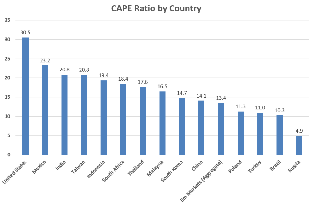
Let’s look at equities first. Below I chart the current CAPE for the United States plus several other emerging market countries, as well as the category average.
Source: Research Affiliates
While the US CAPE ratio is a little north of 30 right now, in emerging markets it’s only a little above 13, which incidentally is about where they were at at the bottom of the financial crisis in 2009. This at a time when developing markets are increasingly important and integrated into the world economy. The 800 pound gorilla in the room of course being China. China is now the world’s second largest economy after the US, and will be #1 within a decade or so. Less commonly known is that China is also home to the world’s second largest stock market. Until recently, most Western investors could only access Chinese stocks through what is called the “H-share” market: giant Chinese multinationals that listed their shares on the Hong Kong Stock Exchange. The nascent mainland or “A-Share” market, however, was not easily accessible to foreign investors. But with several thousand companies listed now with a total capitalization over $7 trillion, Chinese authorities are slowly liberalizing access to the A-share market. Not surprisingly, global asset managers are expected to start pouring in tens of billions of dollars into China in the coming years as a result. Meanwhile, emerging market economies such as China are expected to continue growing at a much faster rate than the US or most other developed economies for decades to come.
What does a CAPE of 13.4 mean in terms of expected return? In the steady-state/earnings-yield approach it would mean emerging market stocks would return 7.5% on average after inflation if valuations remained where they are. More speculatively, if CAPE valuations were to revert to their long-term median of 16.8, that would equate to an additional tailwind of 25% returns (which could be realized over the course of years or in a relatively short burst). Then again, emerging markets are famously prone to overshooting in both directions. In 2007 when emerging markets were on fire their average CAPE got up to about 35 – higher than the US is now! We shouldn’t assume such a revaluation will repeat itself, but if it did it would amount to an appreciation of 161%, all else equal. There’s definitely a lot of room to run with emerging market stocks.
On the fixed income side of things, emerging market debt also looks attractive, at least compared to the meager interest rates on offer in the US and other developed markets. Just a decade ago emerging market bonds were still a rather obscure asset class that individual investors couldn’t easily access. But the category has matured substantially since the financial crisis to become a $19 trillion market (that’s almost as large as the US stock market) and now there are several low-cost ETFs and mutual funds offering exposure to the asset class.

Source: JP Morgan Guide to the Markets
As the EM bond market has grown, so has its quality increased. While in previous decades a significant share of the outstanding developing country sovereign debt was always in default, creditworthiness has gradually improved to the point where bad debts are now a negligible fraction of the overall market. Nonetheless, yields remain elevated, making for an attractive risk/return profile.

Source: Bank of Canada Database of Sovereign Defaults
Generally speaking, emerging market bonds come in two flavors: dollar-denominated and local currency. Bonds issued in US dollars are perceived as less risky as they aren’t exposed to currency fluctuations. Right now US dollar EM bonds have a yield in the neighborhood of 5%. This compares favorably to what is probably its most closely comparable asset class: US investment grade corporate bonds, which sport a yield around 3.2%. Though dollar-denominated EM bonds are priced more like junk-rated high-yield corporate bonds, their riskiness in recent years has been much closer to that of high-quality investment-grade credit, holding up admirably during the 2011 eurozone debt crisis and the 2015 high-yield sell-off, for example. In all likelihood, their fundamentals will only continue to improve as emerging market economies continue to narrow their gap with the advanced economies of the world.
Increasingly, emerging market countries have begun to issue debt in their own currency as well. Local-currency bonds generally sport higher yields while also offering upside from currency appreciation. Of course, this is a sword that cuts both ways as currencies can depreciate as well, which is exactly what happened between 2013 and 2016 as the dollar rose against most every foreign currency, emerging market ones most of all. But with the US dollar now one of the world’s most expensive currencies by purchasing power, and currencies like the Taiwanese dollar, South African Rand, and Malaysian Ringgit some of the cheapest, emerging market local-currency bonds offer the possibility of significant price appreciation on top of the ~6% yields they’re currently offering.
Now, one common objection to the emerging-market-bullishness-as-antidote-to-US-market-bearishness position is that as attractive as these assets may be, if the US goes into a recession/bear market they won’t hold up any better than US stocks. I think this concern is an example of people “over-learning” from their most previous experience, in this case the 2008-09 financial crisis, in which virtually all assets in the world besides high-quality government bonds went into free fall. But the financial crisis was the greatest economic disaster since the Great Depression, and most bear markets simply don’t look quite that bad. Indeed, if we just look at the next-most-recent recession we find that these asset classes would have been good diversifiers for a US investor. Below I plot the performance of the S&P 500 against three emerging market indexes from the top of the dot-com market in September 2000 to its bottom in October 2002.

Source: Morningstar
During the dot-com bust, US stocks lost over 42% of their total value. While emerging market stocks (MSCI Emerging Markets) were hardly a safe haven, they at least lost less money overall, down 33% over the same period. Meanwhile, EM dollar-denominated bonds (Barclays EM USD Aggregate) held their ground and gained a slight cumulative 1.6% during the bust, and EM currencies (JPM ELMI+) actually delivered relatively solid returns, 8.9% cumulatively (I use a simple currency index here as I know of no local-currency bond indexes that go back to 2000).
Put-Writing
As excited as I am about emerging markets, the fact of the matter is that most US investors simply are not comfortable with putting a large portion of their portfolio into foreign assets. Worse yet is when investors do decide to dive into relatively exotic markets, then lose their patience once they inevitably fail to keep up with traditional US assets over some given length of time. The result is typically poorly-timed buy and sell decisions that do no favors to one’s portfolio. This next idea is meant to be less susceptible to such second-guessing.
Most investors are familiar with the concept of stocks options, which give the holder the right to buy a stock at a certain price by a certain date. These are technically call options, and they are often granted to employees and executives as compensation that is supposed to incentivize improving one’s company performance, but they are also traded as a way to bet on stock prices. The opposite of a call option is a put option, which gives the holder the right to sell a stock (or any asset generally) at a certain price by a certain date. An investor can buy a put as a way of betting on the price of a security going down, but more commonly they are used for protection. Suppose you hold a stock that is trading at $100 and you are worried about a sell-off. If you buy a put with a strike price at 95, say, you limit your potential downside to no more than a 5% loss, less the cost of purchasing the put. Puts can be essentially be thought of as insurance contracts on financial assets.
Call and put options are traded on all manner of stocks, commodities, currencies, interest rates and more, including on entire stock indexes like the S&P 500 itself. In fact, S&P 500 index options are some of the most widely traded options there are, with over a million contracts changing hands daily. Now, it’s clear why an investor would want to buy a put option on the S&P 500 if they were worried about a pullback. But in order for an investor to buy a put, somebody else has to be willing to sell, or “write” the put option to them. What does the seller get out of this?
Seemingly, they get a pretty raw deal. The seller of the put collects a small fee from the buyer, called the option premium, which is generally a tiny fraction of the notional value of the contract. And in exchange the seller now has a big liability and no further upside. If the market goes up, the put-writer gains nothing; the option premium is fixed and already collected. But if the market goes down, the put-writer has to cover all losses of the put-holder below the designated strike price. If the strike is 5% below the current market price and the market goes on to fall 30% before the option expires, the put-writer loses the 25% difference. So, put-writing involves small, fixed upside in exchange for an uncertain, large-and-potentially-100% downside. For this reason put-writing and similar strategies have been colorfully described as “picking up pennies in front of an oncoming steamroller.” Seems like a pretty bad deal, huh? Especially now when the market is so high?
Well it turns out it’s actually a pretty great deal. A robust empirical finding in economics is that people are loss-averse and prone to systematically overpaying for insurance, especially in financial markets. While put-writing exposes an investor to downside losses, historically equity options have been priced as though such drawdowns are more probable and extreme than they actually have been on average. And thus the CBOE S&P 500 PutWrite Index, a simple index strategy of selling monthly, at-the-money put options on the S&P 500, has actually delivered virtually the same long-run total returns as the S&P 500 with substantially less risk since its inception in 1986.

Source: Morningstar
Though both indexes delivered the same annualized 10.1% return over this 21-year period, the put-write index did so with a third less volatility (9.8% standard deviation vs. 15.2% for the S&P 500) and much shallower drawdowns during bear markets (down only 26% in the dot-com bust and 33% in the financial crisis). Equity put-writing closely tracks the ups and downs of the underlying market, but attenuates their extremes, making it much more psychologically acceptable than many other alternative asset strategies, in my opinion. I like to think of it as the tortoise counterpart to buy-and-hold stock investing’s hare. Though it won’t keep up in rip-roaring bull markets like the one we’ve been in the last several years, it’s likely to ultimately build the same amount of wealth at a much more steady pace. And with the current US stock bull market as far advanced as it now is, now might be put-writing’s time to shine.
Equity index put-writing is not a strategy that was easily accessible to individual investors until recently, but last year WisdomTree launched the first ETF to track the CBOE S&P 500 PutWrite index. For a 0.38% expense ratio, it’s an extremely reasonably priced way of accessing an attractive alternative asset strategy.
Preferred Stock
Since the end of the financial crisis and the attendant decline in interest rates, yield-hungry investors have scoured the market over for income-producing assets. Asset managers have catered to this demand, launching hundreds of ETFs and mutual funds with “High Yield”, “High Income”, “High Dividend”, or similarly income-oriented themes in their names in the last several years. Not surprisingly, yields have come down across all asset classes as a result. We can see this most clearly in the high-yield bond space, where not only are yields at all-time lows in absolute terms (a little over 5%), their spread over treasury bonds has tightened to near-all-time lows as well.

Source: JPMorgan Guide to the Market
Similarly, the marginal yield on high-dividend stocks has come down compared to the overall market, as it has on many alternative assets like real estate. One asset class that has mostly avoided the contagion of collapsing yields, however, is preferred stocks.
When people talk about stocks or the stock market these days they’re almost always talking about common stock. Preferred stock, on the other hand, is a “hybrid security” that has features of both common stock and a corporate bond. Like a bond, a share of preferred stock has a stated, fixed payout rate associated with it (because it is technically equity, the payout is called a dividend and not interest). Unlike a bond, because preferred securities are not legally debt instruments, if a company fails to make a scheduled payment to its preferred shareholders they cannot force the company into bankruptcy in order to collect. Instead, corporations that are in arrears to their preferred shareholders are forbidden from distributing dividends to their common shareholders. Thus, a company’s management cannot “default” on its preferred shareholders without rendering its common equity worthless, which proves to be the binding constraint that gives preferred stock its value. Preferred stock thus gives the issuing company more flexibility with its financing compared to ordinary debt as it can temporarily suspend payments if necessary in times of financial distress, and as a result of this extra risk borne by the investor preferred stocks generally command a higher yield than a corporate bond would.
Preferred stock has been around since the 1800s and used to be much more popular. This detailed post on preferred stocks from Philosophical Economics points to an article in a financial magazine from 1928 which recommends an allocation of 30% to preferred stocks for a typical investor’s portfolio. But over the years their usage as a source of corporate financing dwindled to the point now where probably most individual investors don’t even know what preferred stock is, much less allocate a third of their portfolio to them. The size of the preferred stock market in the US is “only” a few hundred billion dollars (the US common stock market is well over $20 trillion) and almost all the issuers these days are financial institutions, especially banks. Banks still find preferred stocks an attractive source of financing because under international capital requirement regulations, banks don’t need to set aside as much capital for preferred financing as they do for debt financing (this is due to the built-in flexibility of preferreds mentioned above; a bank that fails to pay its debt liabilities can set off a financial crisis, a bank that fails to pay its preferred dividends almost certainly will not).
Nonetheless, perhaps due to the niche and idiosyncratic nature of the preferred market, being not-quite-stocks and not-quite-bonds (their correlations to either asset class are positive but low), preferreds are a sort of “orphaned” asset class to most investors, who for the most part simply ignore them. As a consequence their yields have remained high, currently in the neighborhood of 6%, which is more-or-less what their long term average has been. Unlike most assets with comparable yields right now, though – like MLPs or for that matter local currency EM debt – their level of risk is rather tame. Though preferreds suffered considerably during the financial crisis (as you would expect of securities mostly issued by financial companies!) their volatility over the last five years has been roughly equivalent to that on investment-grade corporate bonds, and less than that on high-yield bonds, all while exhibiting low correlations to most other assets and so offering diversification benefits.
Even better, because preferred shares are legally equity, not debt, dividends paid to them are generally “qualified” under US tax law. That is, they are taxed at the lower rate (15% for most investors) as opposed to ordinary rates as bond interest income is. For high-net-worth investors who often have the majority of their wealth in taxable accounts and face high tax rates, this makes a huge difference. Consider an investor who pays a 33% ordinary income tax rate and a 15% capital gains/dividend tax rate (typical for many upper-middle-class households) choosing between a high-yield bond and a preferred stock, both yielding 6%. The after-tax yield on the preferred stock is actually 5.1%, but for the bond it’s only 4.02%, a full percentage point less!
In conclusion, by stepping out of the box of conventional stock & bond asset classes, investors may still reasonably hope to earn attractive returns looking forward without taking undue risk. In this post I’ve shared my favorite three slightly-unconventional asset classes for today’s market. Next time, I’ll pick on my three least favorite asset classes that investors should avoid.

