
On July 30th, the US released the worst statistics on economic growth in its history. In the 2nd quarter of this year, US Gross Domestic Product fell at an annualized rate of 32.9% as the nation and the world went into lockdown in response to the coronavirus pandemic. This marks a recession far sharper than anything we’ve ever experienced before; the previous record-worst quarter was Q1 1958 at -10%, and while the official statistics don’t go back as far as the Great Depression, even then the economy didn’t fall so quickly as it has this year. But you wouldn’t know it from looking at the US stock market. After an extraordinarily violent selloff in March, the S&P 500 has come roaring back in the last few months, to the point that as of the end of July it was just slightly above where it was when it started the year.

This strikes many people, myself included, as a bit of a surprise, to say the least. Stock markets often take years to recover from recessions. You might think then that in the midst of what appears to likely be one of the worst recessions in modern history, while entire industries are still effectively shut down, the stock market wouldn’t be behaving as if nothing has changed whatsoever. To many, the market seems to have become completely detached from reality.
To others, the market is merely realizing the continuation of trends that we’d been seeing in the economy for years. The US market’s roller-coaster run to back where it started the year masks extreme disparities of outcomes within the market. The rally of the last few months has been dominated by a handful of tech giants, many of whom have actually benefited from shelter-in-place orders. Thus the tech-heavy NASDAQ index is up a meteoric 25%+ this year. Meanwhile, smaller company stocks, as proxied by the Russell 2000 index, and value stocks – those stocks with lower valuations and lower growth expectations – as proxied by the Russell 1000 Value index, have languished and only partially recovered. Small Value stocks, as proxied by the Russell 2000 Value index, have been clobbered, down almost as much as the NASDAQ is up, a more than 45% return spread between the opposite corners of the market over a period of only 7 months.

This massive gap has only widened a chasm that has been opening up between these different market segments over the last several years. Since the end of the ’08-’09 financial crisis, the S&P 500 has experienced a tremendous bull market, substantially outperforming all other world markets, and this rally has been driven by the spectacular rise of a select group of large technology companies, whose valuations are generally high and keep going higher. Smaller companies, and companies with more down-to-earth valuations, have mostly been left out of the fun.
I have been warning about the high valuation of the US stock market, and the tech market in particular, for several years now. I have generally avoided using the “B” word. Bubbles are episodes of mass hysteria, where valuation metrics jump off the extreme end of the historical graph, where there is no plausible economic explanation to justify them, where speculators with no training make overnight fortunes en masse and convince themselves of their own genius, where the commentariat assert that this is just the way things are now and reality no longer matters. At the start of 2020 I still thought the word “bubble” was an exaggeration for the current market. Now I believe it is appropriate. To understand why, let me explain why – contrary to popular belief – reality actually does matter.
Reality
Between 1871 and 2019 the US stock market had an average annualized return of 9.12%, compounding a hypothetical dollar invested back then into 441,095 of them by the end of last year. How? Where did this massive multiplication of wealth come from? Well, whenever you buy a stock, or a basket of stocks in an index, there are basically two ways you can make money: the company can pay you a dividend, or the price of the stock can go up. And how does the price go up? The price may go up because the fundamentals of the company improved, such as through earnings growth, or it may simply be that people are willing to pay more (or less) for the same stock, irrespective of changes in the fundamentals in the company. Breaking up the return of a stock into these components is called a total return decomposition, and this is what it looks like for the US market since 1871.
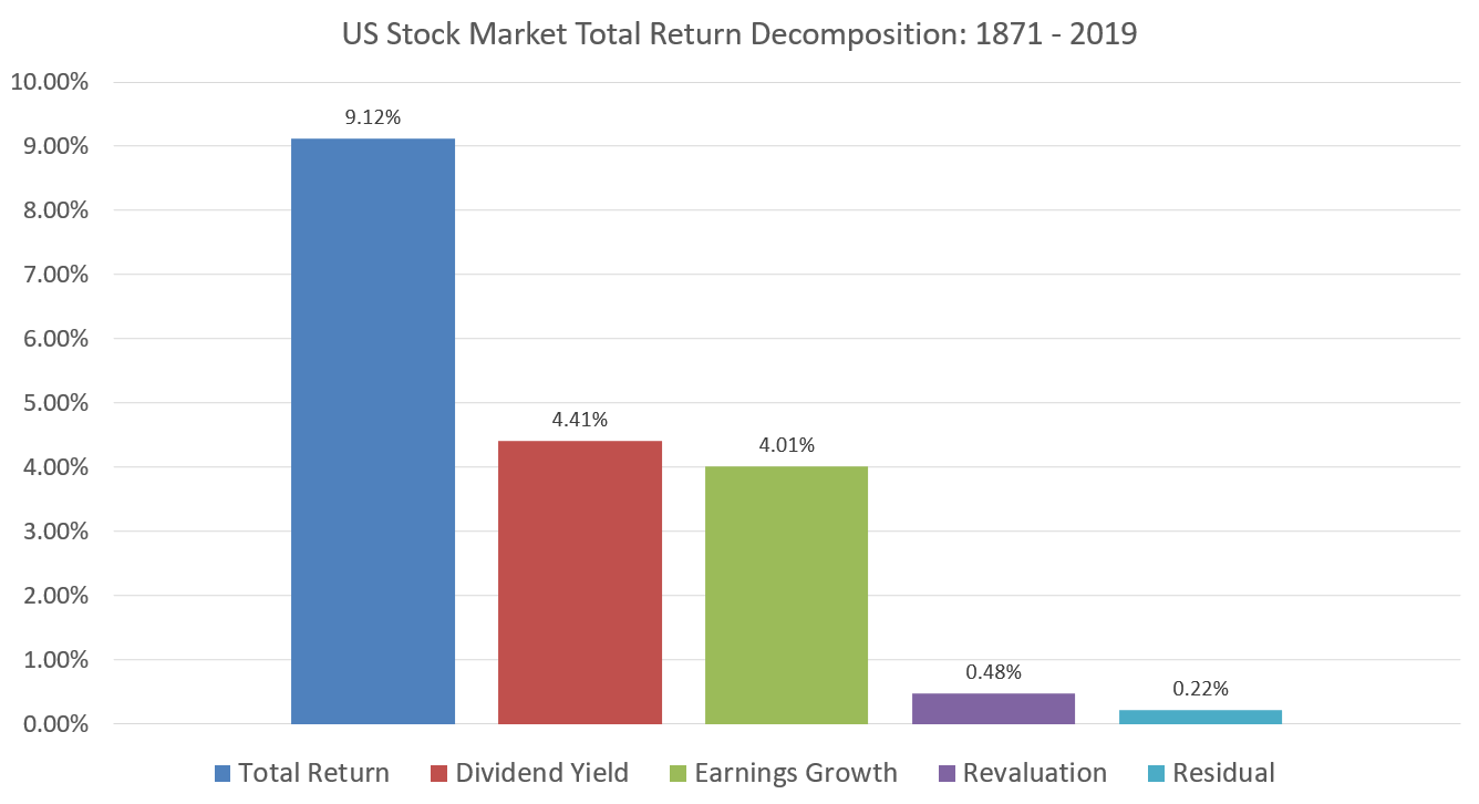
The largest single source of the market’s 9.12% return over this period has been the dividend yield earned by holding stocks, an average of 4.41%. In a close second is the price appreciation attributable to earnings growth. These two components may be considered the “fundamental” source of the market’s return, a reflection of the underlying economic reality of US corporate performance over this period. The third component is the “speculative” component, the price appreciation not attributable to earnings growth, i.e. the change in valuation, or how much people are willing to pay for corporate earnings. This number is much smaller at only 0.48%, meaning that over these 148 years, stocks have become more expensive relative to their earnings, but only slightly. (The last component, the residual, is basically an error term that corrects for the compounding and interacting effects of these variables with each other over time and is not economically meaningful.)
These decomposition figures are about what we should expect in the long run. That is, the dominant source of returns on stocks over time should come from their fundamentals (“reality”). Furthermore, if corporate managers are doing their job and allocating capital reasonably, then the dividend yield and earnings growth components should be of roughly similar magnitude (this is true of the market in aggregate but not of individual companies at any particular time). Revaluation, however, should not be a significant source of sustainable returns. In fact, it cannot be a major source of long-term returns or else we end up at patently absurd conclusions. To see why, let’s look at the relation between stock prices and earnings over time. A straightforward implication of this basic model is that prices should grow alongside earnings and the price-to-earnings ratio should be more or less constant with random bouncing about but no discernible trend. This is indeed what we find when we look at the growth of these variables over time.
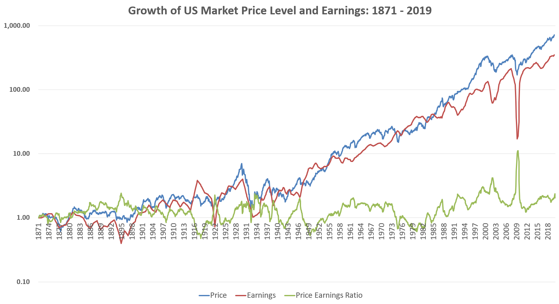 Note that the blue line here represents just the price level of the US stock market, not the total return because we’re not including dividends reinvested, so the annualized return is 4.51%. We can see here that the growth of earnings is doing most of the work here, whereas the 0.48% earned from revaluation seems pretty erratic and unreliable. The price-to-earnings ratio grew from 11.1 in 1871 to 22.8 by the end of 2019, but looking at that growth over time there’s no clear trend one way or another and it’s only been in consistently positive territory since the 1980s.
Now, why must price be joined at the hip with earnings and why can’t valuation expansion be a consistent positive (or negative) source of return? Well, consider what the market would look like if over this period the valuation of the market expanded at the same 4% annualized rate that earnings grew. This would mean that by the end of 2019 the price-to-earnings ratio would have grown, not to 22.8, but 6,408! The market capitalization of the US stock market today is about $34 trillion, if it had a P/E of 6,408 that means the market capitalization would be 9.6 quadrillion dollars! This is far more money than exists in the entire world. There is no conceivable way the market could ever come close to achieving such a valuation; nobody would have enough money to buy shares that high.
On the flip side, imagine if the P/E ratio shrank by 4% per year. This would leave the price level of the stock market the same as it was back in 1871 even as earnings grew several hundred-fold. This would result in an ending P/E ratio of about 0.06, or a total market capitalization of the US of only about $89 billion. At this price, people could easily buy up entire large companies whole and pay themselves the massively larger earnings as dividends, reaping immediate and enormous profits.
So prices and earnings must move in tandem in the long run. Another logical implication of this thinking is that furthermore, earnings cannot grow faster than the rest of the economy indefinitely, or else corporate earnings would eventually constitute 100% of the economy. So along with tracking earnings, prices should also track measures of underlying economic activity like GDP as well. Here is US market prices and earnings alongside GDP since we started officially tracking it in 1947.
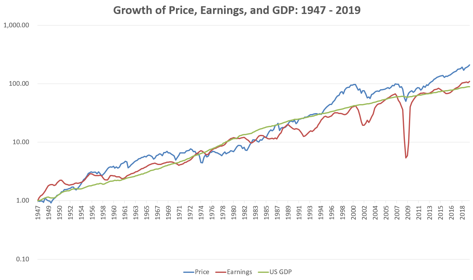
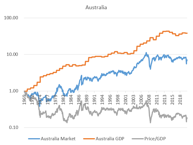
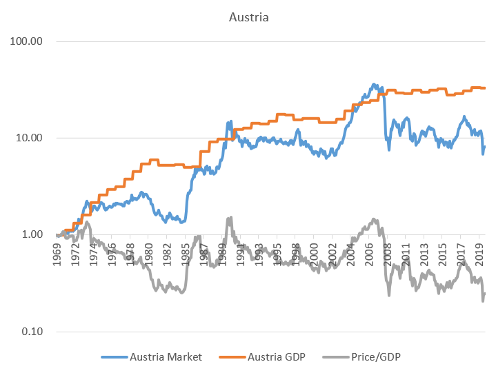
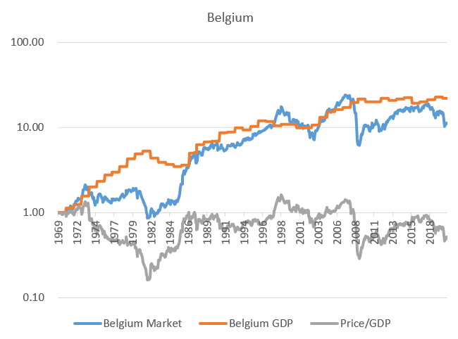
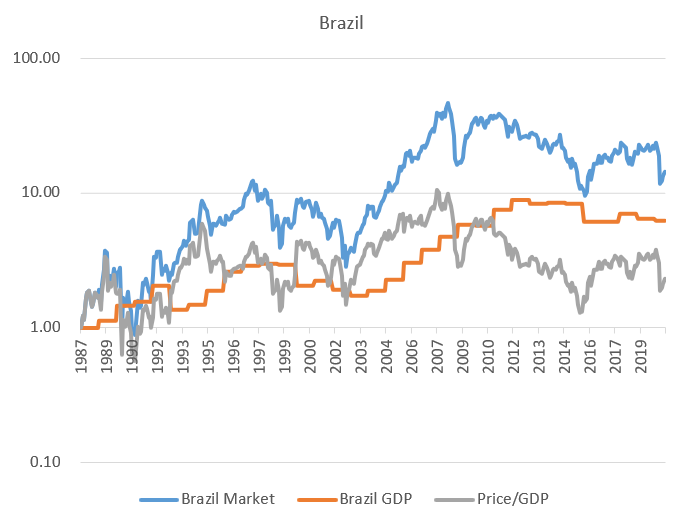
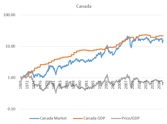
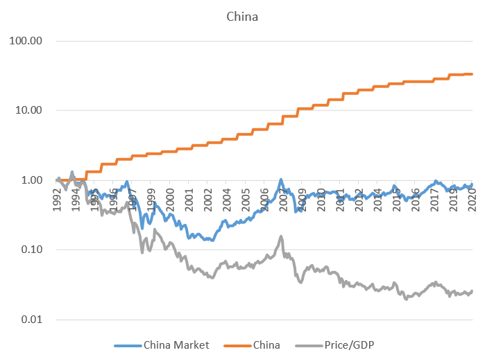
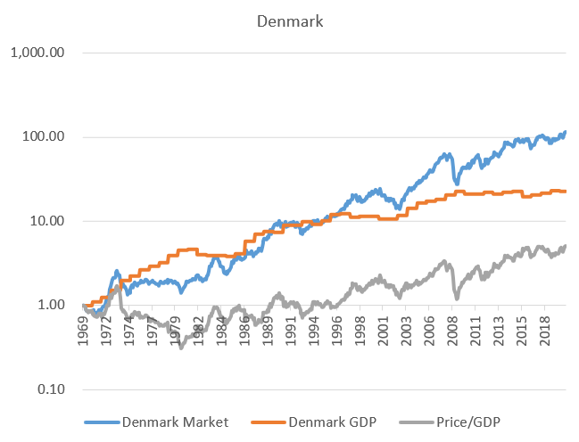
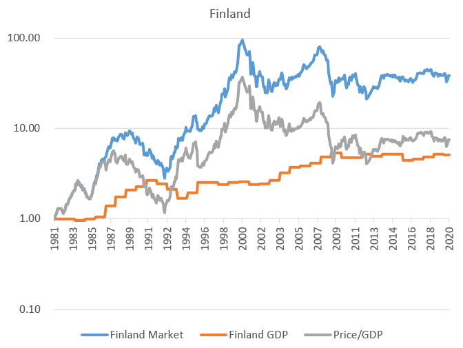
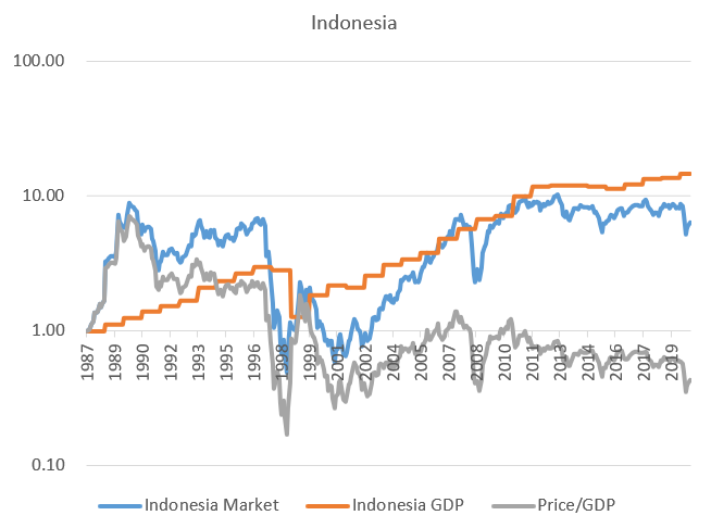
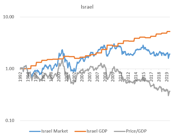
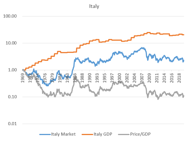
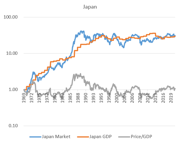
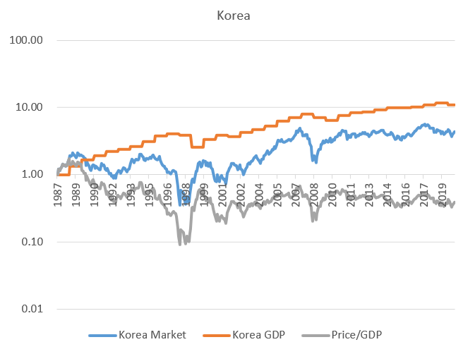
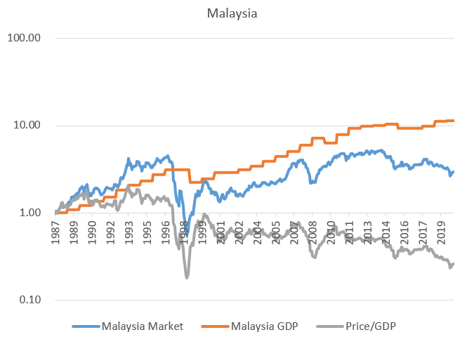
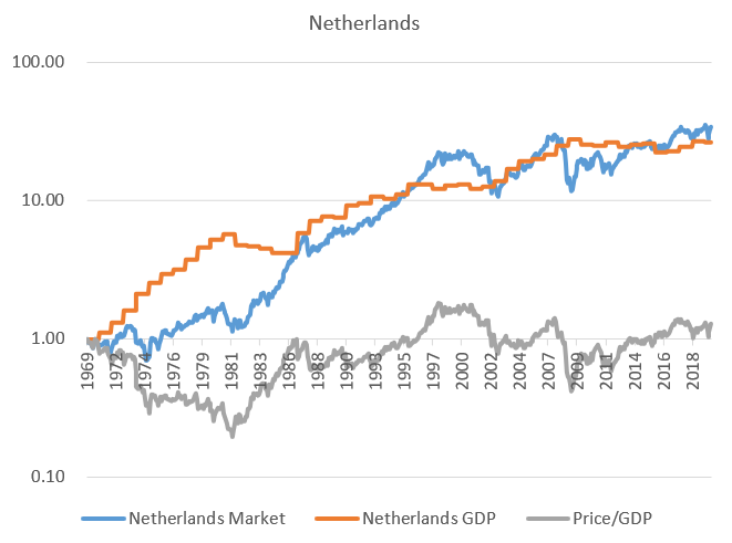
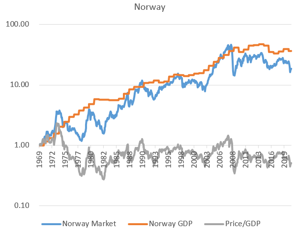
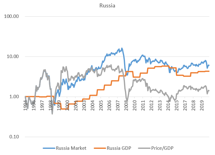
GDP is much more stable than either series and proves a reliable anchor for both. Neither series drifts too far away from trend GDP without eventually coming back. Using GDP is also helpful for making international comparisons. Getting historical earnings data on foreign markets is tricky, but GDP data is readily available. Below I plot the growth of stock index price levels, GDP, and the ratio between them for 29 different foreign markets, going back as far as MSCI’s index price data.
-
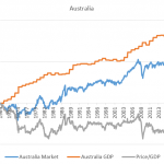
- Australia
-
- Austria
-
- Belgium
-
- Brazil
-
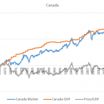
- Canada
-
- China
-
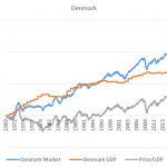
- Denmark
-
- Finland
-
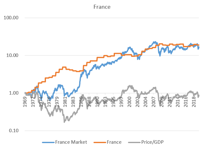
- France
-
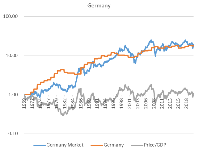
- Germany
-
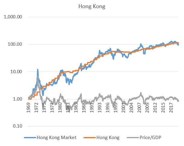
- Hong Kong
-
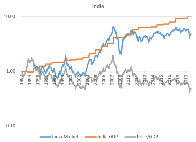
- India
-
- Indonesia
-
- Israel
-
- Italy
-
- Japan
-
- Korea
-
- Malaysia
-
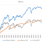
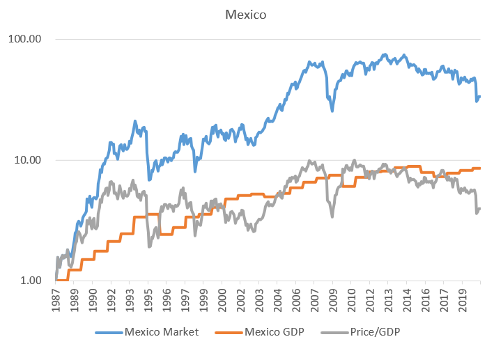
- Mexico
-
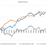
- Netherlands
-
- Norway
-
- Russia
-
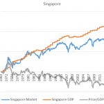
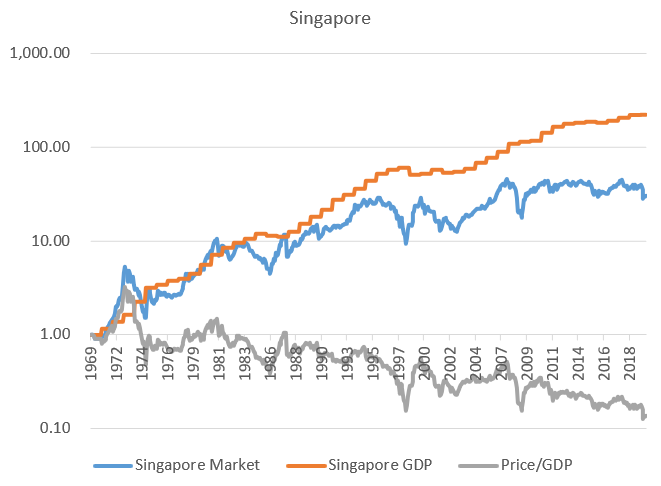
- Singapore
-
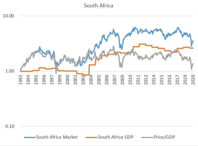
- South Africa
-
- Spain
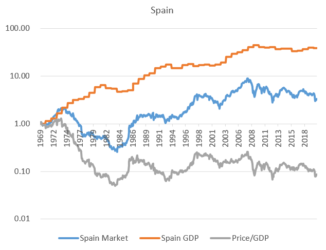
-
- Sweden
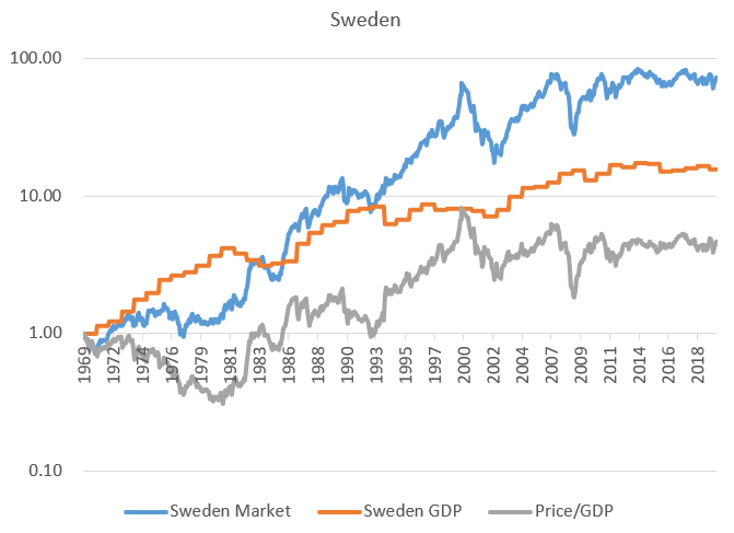
-
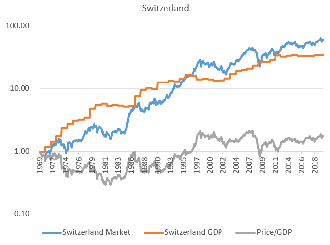
- Switzerland
-
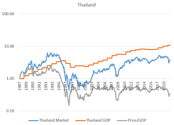
- Thailand
-
- United Kingdom
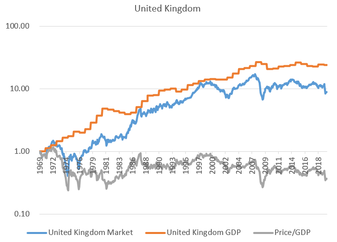
This exercise is helpful in confirming our intuitions both that A) stock prices have to eventually be grounded in economic reality, and B) this law is statistical in nature and there are plenty of times and places where it seems to go quite a while without being enforced. Some countries seem to have hit the nail on the head over the course of the sample period, such as France, Germany, Hong Kong, and Japan. Others have had markets that seem to have overshot their economy for decades, such as Mexico, while for others it’s the other way around, such as China. This is exactly what we would expect from a financial market process where random forces play a large role. But looking at either the mean or median across these different markets we see that the price-to-GDP ratio exhibits no significant trend up or down.
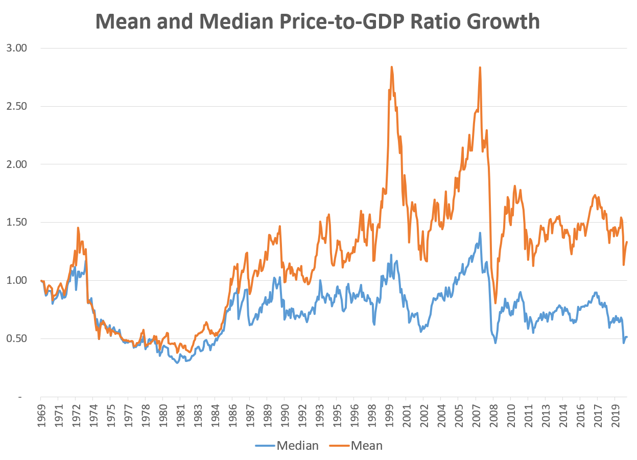
Indeed, not only is there no significant trend over time, both series exhibit strong evidence of mean-reverting behavior; if you observe the ratio is higher than average one year, it’s much more likely than not that it will be lower next year, and vice versa. So valuations, though constantly bouncing up and down chaotically, are more or less constant in the long run and eventually come back to their mean. Imagine an easily distracted dog tied to a post with an elastic band and you’ll have a good metaphor for stock market valuation, and indeed of the minds of many investors.
If valuations are mean-reverting that means that when prices get out ahead of fundamentals that we should expect that either A) fundamentals will soon “catch up”, growing faster than usual, or B) prices will fall back down, or at least increase slower than usual. Looking at the data, which do we see? A little bit of both, actually. Returning to the US market, we do indeed see that when the price-to-earnings ratio is relatively high, earnings growth over the subsequent year is usually higher than average.
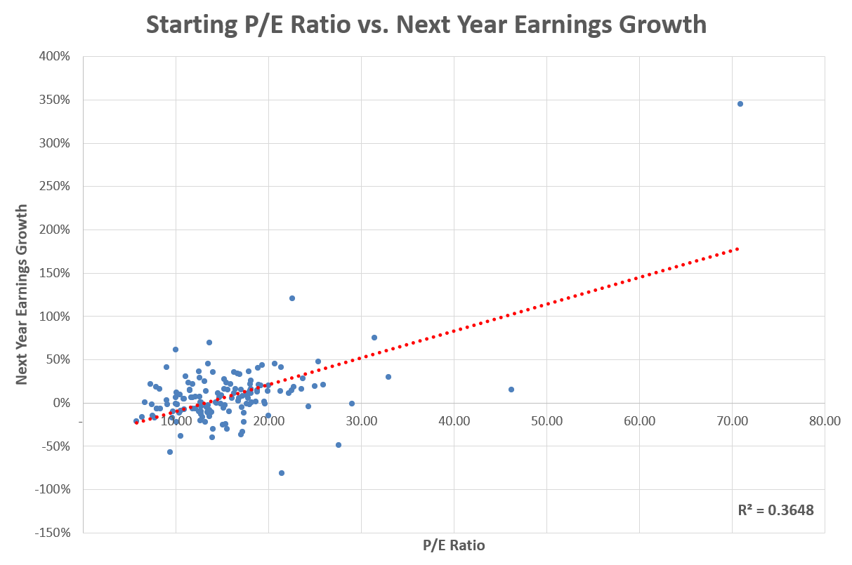
Most of the action here though is coming from recoveries from recession. During deep recessions, the P/E ratio based on last-year earnings often shoots up as earnings fall faster than prices. You can see this clearly in the graph above of the growth of prices, earnings, and P/E around the time of the ’08-’09 financial crisis. The P/E ratio shot up to an all-time high during that period as earnings fell off a cliff, but they quickly recovered the next year. Outside of these recovery periods, however, earnings growth exhibits little predictability. During times when the P/E ratio is high not because earnings have declined but because prices have increased – that is, during bull markets – the P/E ratio does not do a good job predicting earnings growth. Indeed, the most common way people forecast earnings growth – by extrapolating recent growth – is the opposite of effective. Last year’s earnings growth has zero relation to next year’s earnings growth, and the last ten year’s average earnings growth is slightly negatively correlated to next year’s earnings growth.
Investors are generally not concerned with earnings growth per se, however, but with their returns. If you buy stocks at a high valuation because you believe that means future earnings growth will be high, and it does come in high, that’s all fine and good, but if that’s what the market was already expecting then your return might not be particularly great. What we really want to know is if valuations predict future prices, or returns more generally.
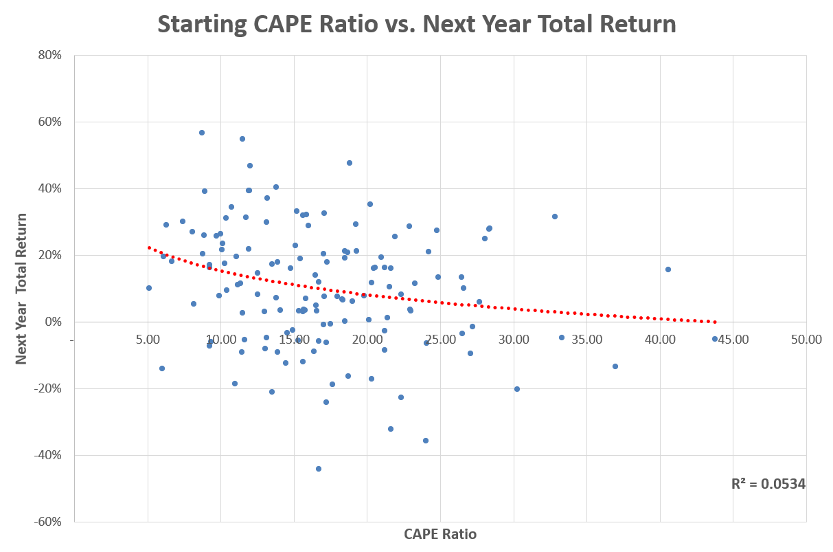
When we plot this measure of price-to-earnings ratio based on last year’s earnings against the next year’s price return or total return, we do indeed find a negative relation. High valuations now predict low returns later. But the magnitude of the effect is very small and not statistically significant using this “simple” P/E ratio. This is probably because as we’ve seen the metric is very erratic around recessions and likely to tell us the market is “overvalued” even when prices are historically low. For this reason it’s common to use a more stable measure of earnings in the denominator, the most famous of these being the Cyclically-Adjusted Price-to-Earnings ratio, or CAPE, a measure I’ve spoken about on this blog many times. The CAPE uses the average of inflation-adjusted earnings over the last ten years in the denominator, which means any one year will not throw off the results too much, providing a more stable anchor against which to compare price to.
The CAPE ratio has been a strong and significant predictor of future price and total returns. When the CAPE ratio is unusually high, stock prices are much more likely to fall. Here it is against one-year-forward total returns.
Okay. And where are we today? As I’ve written about here a number of times, the CAPE ratio for the US market has been in elevated territory for the last handful of years. As of the end of July it’s just north of 30, putting it in about the 95th percentile of its history.

Based on the regression results above the predicted value for the total return over the next year based on today’s value is only about 3.2%, though of course the error bars on that are pretty wide. (I’ve also cautioned in the past about so straightforwardly interpreting the results of regressions like this. Don’t take such numbers too seriously, they are for illustrative purposes only here.)
But as we established above, earnings are not the only fundamental metric prices ought to be anchored to. We should expect alternative valuation metrics that place different economic fundamentals in the denominator to have similar predictive results, and using multiple in conjunction may potentially add more explanatory power. Comparing the price level to GDP is an obvious choice based on our analysis above. It’s also clear why it might be complementary to price-to-earnings. If both prices and earnings have been increasing at a faster rate than GDP for a while then the P/E ratio might not seem too high relative to a price-to-GDP ratio, but this could be illusory as we know earnings cannot grow faster than GDP indefinitely. This is in fact what has happened in the US market, as corporate earnings have outpaced overall economic activity since the end of the financial crisis. This can’t last forever. So how do stock valuations look relative to GDP right now? Below is the ratio of total stock market capitalization to GDP. It’s, um… a bit on the high side right now.
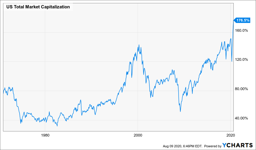
The total value of the US stock market is now about 176% that of our economic output. This is higher than any other value on record, including during the dot-com bubble when it peaked at about 146% of GDP. This metric would seem to indicate that things are approximately 30 percentage points more bubbly now than they were back then.
Now, investors sometimes argue about which valuation metric is better than others, but I think this is silly. It’s not about better, it’s just about different. When we’re trying to measure an abstract concept like valuation, using multiple metrics that capture different variants of potentially relevant information is often better than relying on a single metric. So let’s look at four different metrics together: price relative to cyclically-adjusted earnings (CAPE), GDP, book value (price-to-book), and US personal income. All of these capture a different aspect of what we think of as economic fundamentals and should all grow at approximately the same rate over the very long run. Here is their evolution over time back to as far as I can get the relevant data. Because these all have different mean values I re-scale the series to express them as what percentile of history they fall in at a given time.
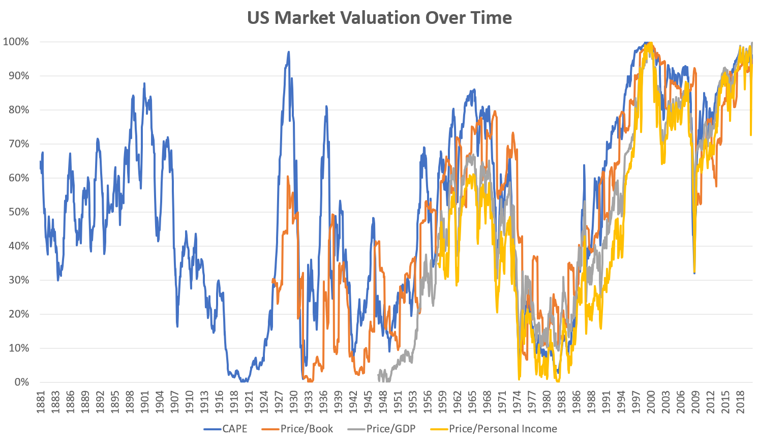 As we should expect, all of the measures are closely – but not perfectly – related to the others, suggesting they’re capturing complementary aspects of market valuation. But every single one of them is near the top of the chart as of the end of July. Price-to-book is the lowest at “only” the 93rd percentile of its history, vs the highest being price/GDP at the literally-never-been-higher 100th percentile. The average of the four values is 96%.
Now let’s see how using the average of these different metrics predicts future returns.
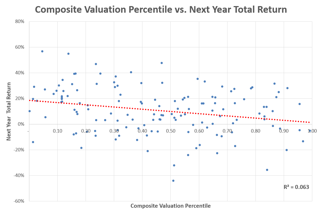 As expected, the higher the composite value of these valuation metrics are relative to history, the lower next year’s returns are. The relation is strongly statistically significant and we improved our explanatory power about 20% compared to just using the CAPE ratio. (More importantly for the real world, using composite metrics like this is more robust to out-of-sample testing than individual metrics usually are.) It also gives us an even more pessimistic projection for the US market: plugging in today’s values we get an expected return of just 1.9%, which is approximately nothing after inflation.
And so, here at the start of one of the worst economic downturns in modern history, we also find ourselves in a stock market bubble, at valuations unseen since the dot-com days of twenty years ago. And like then, these extreme valuations mask a great deal of heterogeneity within the market. Next week we will return to where we started this piece, puzzling over the massive differences in fortunes of small and value stocks versus the tech giants of the NASDAQ.


